A couple years ago, the European Organization for Nuclear Research (CERN) made the largest discovery in the field that had been seen in over 40 years. Physicists proved the existence of the Higgs boson particle—more commonly called the God particle—that pretty much explains the entire universe. Exciting, right?
Something this huge, you’d think that #godparticle would have been the biggest Twitter trend since #slicedbread. Instead, the Twittersphere swarmed with complaints over the font used by the CERN folk in their live webcast presentation: the dreaded Comic Sans.
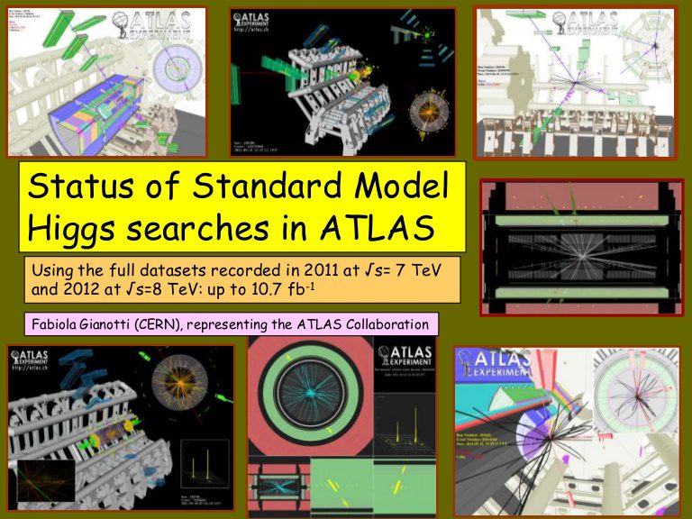
In most cases, solving the mysteries of the known universe shouldn’t pale in comparison to which font you choose for your website or project, but the level of vitriol over Comic Sans in particular shows that isn’t always the case. What makes typography such a big deal, anyway?
Personality Profile
Typography encompasses more than just font choice. The spacing between letters and words combined with the way text block layouts flow on the page are also included under the typography umbrella. All of these elements help inform the personality of your site or brand.
The rounded look of Comic Sans, for example, seems casual and likeable. Others say it’s not so much casual as it is straight-up childish. Bold fonts come across as striking and dramatic, while script looks elegant and classic. What mood is your site going for? Compelling? Inviting? Creative? Edgy? Typography contributes to the first impression of any site or brand, so make sure your choices are appropriate.
Send a Clear Message
This post from Buzzfeed very amply shows the ways that typography’s clarity (or lack thereof) impacts brand image. Some of these embarrassing faux pas could have been prevented by a little more space between letters or using a different font entirely. Instead, the customer is left with a message that’s somewhere between double-take and offensive. Maybe both.
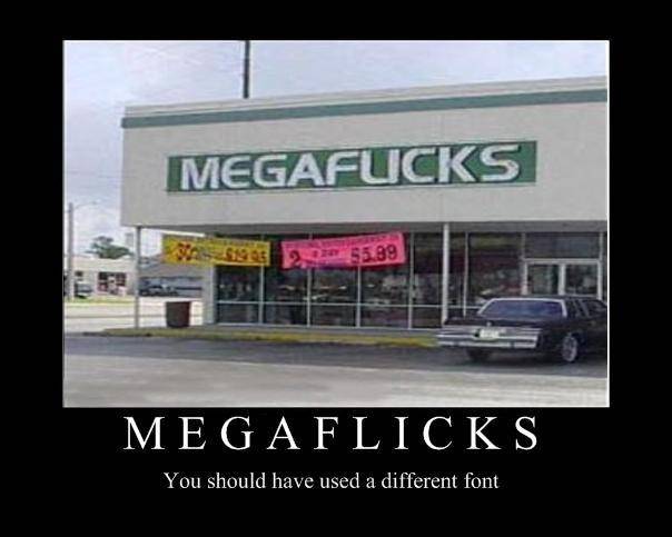
You strive for precision in all your other marketing efforts—defining your target audience, thinking about the message you want your brand to convey, and so on—and bad typography just muddies the waters back up again. You also put a lot of time and effort into ensuring that your site delivers high-quality content. Yet, no matter how genius that content may be, it’s worthless if it’s too illegible to actually read.
Typography is more than merely decorative; it’s one of the components that helps to define a site’s tone—and therefore, the tone of your brand, service or product. Good typography will serve as the perfect complement to the rest of your company message, while bad typography will detract from it. Typography functions as a main dish, so don’t treat it it an afterthought.

