Most calls to action are too loud. Most content endings are too quiet. But somewhere in between is a moment—soft, useful, unforced—that turns passive readers into long-term followers.
You’ve probably seen it before: you finish a blog post, and instead of a pitch, you get a gentle offer—“Want a quick checklist to help you apply this?” It’s not pushy. It’s not flashy. But it works. You pause. You consider it. Sometimes, you click. And when you do, it doesn’t feel like marketing. It feels like help.
That’s what this article is about.
We’re calling it frictionless microengagement—and once you learn how to use it, it’ll quietly transform how your content earns trust, encourages action, and keeps readers coming back.
1. What Is Frictionless Microengagement?
Frictionless microengagement is a well-timed, low-effort invitation that guides the reader to their next step—offered right when they’re most likely to say yes. It’s not a pop-up or a pitch. It’s that subtle nudge at the end of a blog post or video: “Here’s a quick template if you’d like it.” The magic lies in how naturally it follows the value you’ve already delivered. It doesn’t feel like a call to action—it feels like a favor.
That smoothness is what sets it apart. Traditional CTAs hit like speed bumps—demanding clicks or sign-ups just as attention starts to fade. Microengagements don’t interrupt; they extend. Like your phone suggesting the exact app you were about to open, they feel aligned, timely, and easy to accept.
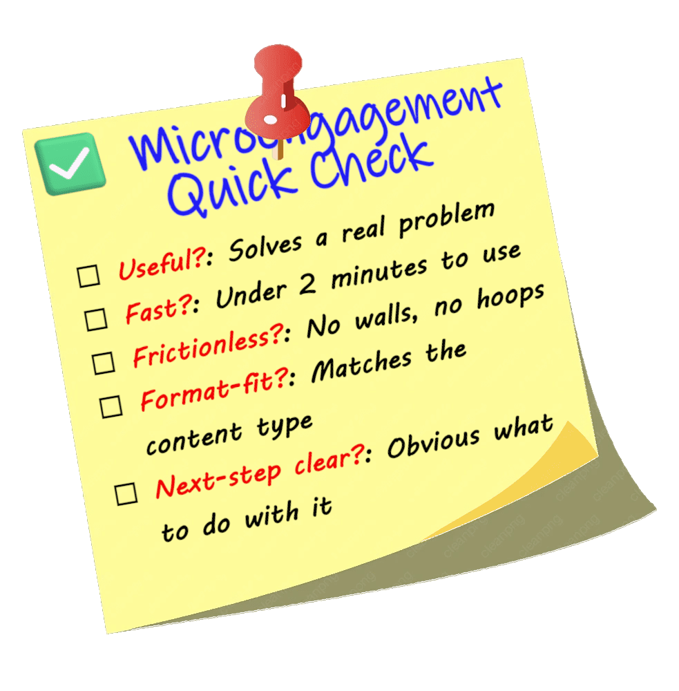
And it works because it’s small. Not a webinar. Not a whitepaper. Just a swipe file, a cheat sheet, or a two-minute takeaway. The value is immediate, the ask is minimal—and that’s what makes it sticky. More importantly, it’s not “Do this for me,” but “Here’s something that helps you.” That subtle shift in intent—service over strategy—is what builds trust. If you want to see that in action, take a look at this 1-page cheat sheet with five frictionless microengagements you can adapt for your own content. Quick, useful, and built on the very principles this post is about.
See what I did there?
One of the best real-world examples of this is ChatGPT. After answering a question, it often offers a summary or checklist—not with a pitch, just a soft, relevant next step. I’d skip it half the time, but I’d always pause. And that pause? That’s the engagement. When the offer hit the mark, I clicked. It’s a masterclass in subtle UX—content that respects your attention, rewards your curiosity, and keeps the momentum going without ever forcing it.
2. The Psychology Behind the Click
Microengagements might look simple on the surface—but they work because they tap into powerful behavioral instincts. Here’s what’s really happening behind that quiet “yes.”
They build momentum through micro-wins
When someone says yes to something small—a swipe file, a two-minute checklist—they’re more likely to say yes again. It’s not a funnel. It’s a foot in the door. That first micro-commitment sets a precedent, making the next interaction feel easier and more familiar.
And when that value feels like a gift rather than an ask, it does more than earn attention—it earns goodwill. That’s the principle of reciprocity: help someone, and they’re more likely to help you in return. A reader who feels supported is more likely to subscribe, share, or click. Not because they were told to. Because they want to.
This is how microengagements build momentum. They don’t push conversion. They prime it—by stacking small, positive interactions that lead to trust over time.
They open loops your audience wants to close
The Zeigarnik Effect tells us we’re wired to remember incomplete tasks more than completed ones. A checklist, worksheet, or template doesn’t just deliver value—it quietly creates tension. It opens a loop.
Even if the reader didn’t plan to act on it, now it’s in their head. That one-page worksheet? Suddenly it feels like something they need to fill out. That subtle mental itch keeps your content lingering in their mind—and often brings them back.
It’s not manipulation. It’s invitation. You’re giving them something that asks to be used. And that gentle pull turns passive readers into active participants.
The Practical Upside
Microengagements aren’t just smart psychology—they’re sharp strategy. These lightweight offers quietly do the kind of work that bigger, louder tactics often miss. Here’s what they unlock.
They turn content into an asset, not a moment
A good microengagement gives your content legs. A great one makes it worth coming back to. Short, useful tools like swipe files or checklists don’t just reinforce your point—they extend your presence. That one-pager? That’s what gets bookmarked, forwarded, or dropped into a client folder. It’s the part that travels farther than the blog post ever will.
And over time, if readers start to expect something helpful at the end of every piece, they begin to return not just for the insight—but for the experience of being supported. That’s how habits form. That’s how trust compounds.
They deepen interaction and build brand memory
Every extra step a reader takes—downloading a file, opening a tool, applying a resource—adds weight to their experience. It’s not just about keeping them on the page longer. It’s about shifting their perception: from “I read something” to “I used something.” From “this brand is smart” to “this brand is helpful.”
That simple checklist at the end of your blog post? It turns passive attention into active recognition. It gives your content a second dimension. And in a world of shallow impressions, that kind of depth is what makes people remember—and return.
3. How to Build Your Own Frictionless Microengagements
Frictionless microengagements aren’t just little bonuses—they’re carefully chosen next steps. They work best when they feel like a natural extension of the value you’ve already delivered, not an afterthought. Think of them as bridges: from insight to action, from idea to execution.
The most effective microengagements answer a question your reader is already asking:
“What should I do next?”
So before you create one, ask yourself:
- What problem does this content solve?
- What would help the reader apply it immediately?
- Where can I reduce friction between understanding and action?
Once you have that answer, the key is to keep the offer lightweight, clear, and instantly usable. Your reader should be able to engage without hesitation or explanation.
Here’s what that looks like:
- Immediately useful – It solves a problem or shortcuts a process right away.
- Quick to consume – Two minutes or less. Skim-friendly, printable, or savable without effort.
- Low commitment – No opt-ins unless the value is crystal clear. If you do ask for an email, make the tradeoff irresistible:
“Download the full 20-point checklist our top clients use to plan every launch.”
And always make sure the format fits the function. For example:
- A blog on email strategy? Add a subject line swipe file.
- A guide on storytelling? Offer a brand narrative worksheet.
- An SEO tutorial? Include a Google-friendly blog post template.
You’re not upselling. You’re completing the thought—and making the next move feel obvious.
Match Format to Function
A great microengagement isn’t just about what you offer—it’s about how you deliver it. The format you choose should fit the reader’s intent and the kind of action they’re ready to take. A swipe file hits differently than a checklist. A case study teaches differently than a template.
So instead of defaulting to a downloadable PDF, ask yourself: What’s the simplest, most effective way for someone to use this?
Here are some tried-and-true formats:
- Swipe file – Ideal for content that hinges on language. Think email subject lines, ad copy, CTAs, social media hooks.
- Checklist – Great for step-based processes, best practices, or anything where someone might say, “Am I doing this right?”
- Template – Perfect when your reader wants to plug in their own content—blog outlines, sales pages, pitch decks, etc.
- Quick calculator – Use when data matters. Whether it’s budgeting, ROI, or capacity planning, this format turns insight into numbers.
- Mini case study or before/after snapshot – Use when you want to show how a principle works in action. Fast proof, not long reads.
Pro tip: If it can be printed, bookmarked, or saved with one click, you’re doing it right.
The best format is the one that removes the most friction between your idea and their execution.
Place It Where It Belongs—and Give It a Gentle Hook
The most effective microengagements don’t just exist—they land. And where they land matters.
Your best window is right at the end of your content—when the reader has just finished, trust is high, and they’re mentally asking, “What now?” That’s where a well-placed microengagement feels like a natural next step, not a promotional detour.
Drop it directly beneath your main content. Skip the sidebar. Skip the footer. Use a clean graphic button, a stylized text block, or an inline callout—anything that visually signals, “You’re not done yet. Here’s something to help.”
And if you want to deepen the pull, consider adding a light task loop—just a simple suggestion that nudges the reader to act:
- “Use this to score your last three email subject lines.”
- “Try filling out the worksheet for your current brand story draft.”
- “Apply this checklist to your most recent blog post and see what’s missing.”
You’re not assigning homework. You’re planting the seed. And that soft psychological hook—the one that invites, rather than demands—is often what makes your content linger just a little longer.
4. Content Isn’t Finished Without a Path Forward
Too often, content just… stops. A polite sign-off—“Thanks for reading!” or “Hope that helped!”—and the moment is over. But for a reader who’s still mentally engaged, that kind of fadeout feels like a dead end.
The reality? If your content delivered value, your reader is likely wondering, “What’s next?” And if you don’t offer them a next step, they’ll either click away—or go looking for it somewhere else.
That’s where microengagements come in. They shift the ending from a full stop to a soft continuation. A checklist. A tool. A next-step resource. It’s not a pitch—it’s a path.
Think of it as a soft handshake at the end of a conversation—warm, intentional, and respectful of your reader’s time. You’re saying, “I see you. Here’s something that might make your next step easier.”
That gesture doesn’t have to be loud. In fact, the quieter it feels, the more natural it lands:
- “Here’s what to do with what you just learned.”
- “Here’s how to take this further.”
- “Here’s a shortcut that builds on this.”
Even if the reader skips the offer, the fact that it’s there makes a difference. It shows care, not pressure. It extends the conversation instead of closing it. And that last, thoughtful nudge is often what makes your content feel complete—not transactional, not abrupt, just finished right.
How Micro Builds Macro
One swipe file won’t build a relationship. But five well-timed nudges that each offer real value? That’s trust in motion.
Microengagements aren’t just clever content tactics—they’re compound interest for your brand. Every low-effort offer that meets the reader where they are adds a layer of credibility. Not because you said, “Trust me,” but because you showed up consistently with something that helped.
Over time, those moments stack. Each checklist, each swipe file, each subtle suggestion sends the same quiet message:
“You don’t have to figure this out alone. I’ve got something that helps.”
That’s not a pitch. That’s a relationship being built—one micro at a time.
And that’s the shift: this isn’t about clever tricks. It’s about redefining what it means for your content to be done.
Publishing isn’t the finish line. Real completion happens when your reader leaves with momentum—when they feel more equipped, more confident, or more curious than they were a minute ago.
That’s what frictionless microengagements are built for. Not to impress. Not to sell. But to make sure your content keeps moving—even after the scroll stops.
It’s Not a Tactic. It’s a Way to Treat Your Reader.
Frictionless microengagements aren’t about cleverness. They’re about care. They’re small gestures, timed right, that tell your reader: I’ve thought about what you need next—and I’ve got you.
Used well, they don’t just make your content more useful. They make your brand more human.
So the next time you finish a piece of content, ask yourself: Have I left the reader with something to hold onto—or just something to scroll past?
That’s the real difference between content that converts—and content that connects.